
Thinkchain
Design Think Tank is a multidisciplinary brand that offer design and business coaching services that range from innovation workshops, financial empowerment education (Duo Parity), blockchain community building (Thinkchain)
Client: Design Think Tank
Timeline: 8 Weeks (20 hours per/week)
Roles: UI Designer for Thinkchain
Tools: Adobe XD, Miro, InVision
Rebranding Thinkchain’s marketing site and optimizing for mobile
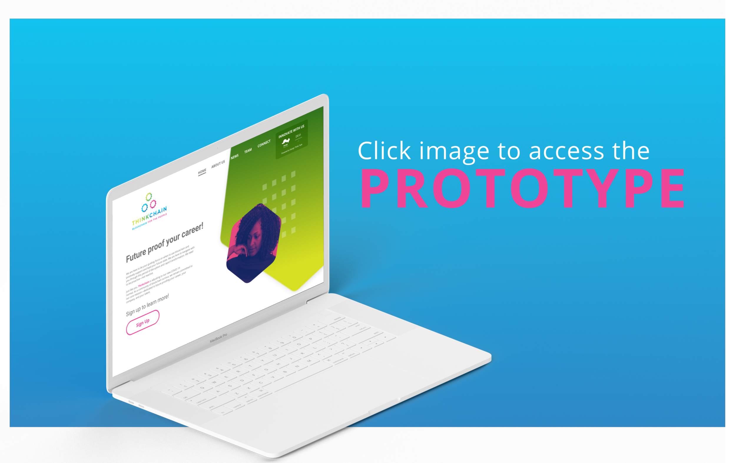
view final prototype


Project Summary

Connecting all brands of Design Think Tank
The client came into the project desiring a re-focus of the brand’s current three marketing sites so each could have it’s own voice and purpose while communicating it’s under a single umbrella organization. While each micro brand has service offerings for distinct audiences and industries, all three brands should communicate a sense of inspiration and induce action.
Target Users
Users for Design Think Tank, Duo Parity and Thinkchain are forward thinkers wanting to innovate and collaborate and increase design knowledge and social change. The targeted users for this project were:
Designers advocating for design thinking of their organization
Enterprises and small business leaders seeking design and innovation training
Individuals seeking to upskill themselves in design and innovation
Constraints
It is required for all three brands to stay fairly the same while finding a way to be cohesive. Given that, there are a couple of constraints that challenged me to solve the design problem for our stakeholder.
All three brands have different color schemes Thinkchain’s color palette was completely different from Design Think Tank and Duo Parity.
Typography Design Think Chain and Duo Parity’s font is Lato while Thinkchain’s is Open Sans. The client wanted to keep the same fonts from the original marketing sites.
Research Approach
![Showcasing the strengths, weaknesses, and opportunities for the Design Think Tank Network]](https://images.squarespace-cdn.com/content/v1/5f427bb00086db7a1e890cef/1600842181487-QQ3U1X6RE4WT7Q50XKMO/SWO.png)
Showcasing the strengths, weaknesses, and opportunities for the Design Think Tank Network]
We started on the right path of gaining more insight from our client after the kickoff meeting that was 60 minutes that I presented. My teammate facilitated Rose, Bud, Thorn workshop to see what was positive, negative, and what had potential in the current marketing sites. The end result was modernity was stressed during the workshop.
Established Research Questions: Design thinking consulting was very new to me and I wanted to get a clear understanding of it. So before our kickoff meeting with our client. Our design team of three started to conjure up questions and points of interest to define the problem that we’re going to solve.
Analyzed Competitors: Along with that process we looked into Design Think Tank’s six competitors and analyzed their web designs from the overall look, feel, tone of their respective designs, even down to the color palette, typography, and use of hierarchy.
Conducted Exploratory Research: I went in-depth with some exploratory research to add to the competitive analysis. I felt that we needed more insight into the design thinking industry. During the research I discovered a few things that can be considered in our design decisions like knowing emerging industry trends such as consumer privacy, cross-generation techies, and financial habits. From a design standpoint the leaders of the industry shared similarities of having a very simple and clean layout, sans sers typography and great use of whitespace.
Research Artifact: Style Tiles
From interviewing the stakeholder and analyzing the competitors’ design elements from the layouts, color scheme, typography, and iconography gave me the inspiration to experiment and offer different concepts as well as a modernized version of the original for the Design Think Tank brand.
Abstract Style Tile
As mentioned in the mood board summary, this was inspired by the Google slide deck from our kickoff meeting. The abstract, modern, sharp, and closed aesthetic gives it a grounded feeling. It gives off a business look for the modern era. The font choices of Poppins - bold as the H1, Poppins - Medium as the H2, and Poppin - Regular as the body, give it a consistent hierarchy in the typography. Button style with sharp edges complements the fonts and the iconography. The colors of red, gold, dark, and light grey, with white offer great contrast.
Innovation Style Tile
This design offers an alternative style. Dark theme websites are gaining more popularity whether it’s for aesthetics or functionality. The advantages of dark theme websites that it reduces eye strain in low light conditions and it saves energy with your devices. So having a muted color palette creates the right amount of contrast in legibility. Even though there are websites that are already using dark it’s still innovative because there’s a lot to be explored. I’m of fan of consistency in typography. So I went with InaiMathi - Bold and InaiMathi - Regular. I wanted to add more dimension to the buttons with a gradient.
Modernized Original Style Tile
This style tile was inspired by the WDT style guide. I wanted to see if I can give it a different look with the color palette. I thought an open, clean, light design will give the user a calming effect. Objectivity is a very versatile font that can be used for startups and corporations. I went with a purple button because it contrasts more on white than yellow shown on the current website. I went with illustration treatment because it compliments the overall look of the design.

Style Tile 1: Abstract Concept

Style Tile 2: Innovation Concept

Style Tile 3: Modernized Original
User Research On Style Tiles

We gained more insight after conducting a total of three user interviews with Zoom for 45 minutes each. The users were chosen by the client because of their work history and are credible sources of knowing what our client is looking for. I facilitated the first interview and my teammates conducted the other two because I wasn’t available. After presenting a total of nine style tiles for Design Think Tank to get user feedback and to see which design direction we should go with.
Key Insights
Users responded well to a clean open feeling design
Diversity is very important theme that needs to be implemented
Innovation and forward thinking was equally important
Users desired a modern aesthetic
“Don’t let the design get in the way of the message.
”
We started on the right path of gaining more insight from our client after the kickoff meeting that was 60 minutes that I presented. My teammate facilitated Rose, Bud, Thorn workshop to see what was positive, negative, and what had potential in the current marketing sites. The end result was modernity was stressed during the workshop.
Research Discoveries
Thinkchain’s color palette was completely different from Design Think Tank and Duo Parity.
Design Think Chain and Duo Parity’s font is Lato while Thinkchain’s is Open Sans. The client wanted to keep the same fonts of the original marketing sites.
Initial UI Design

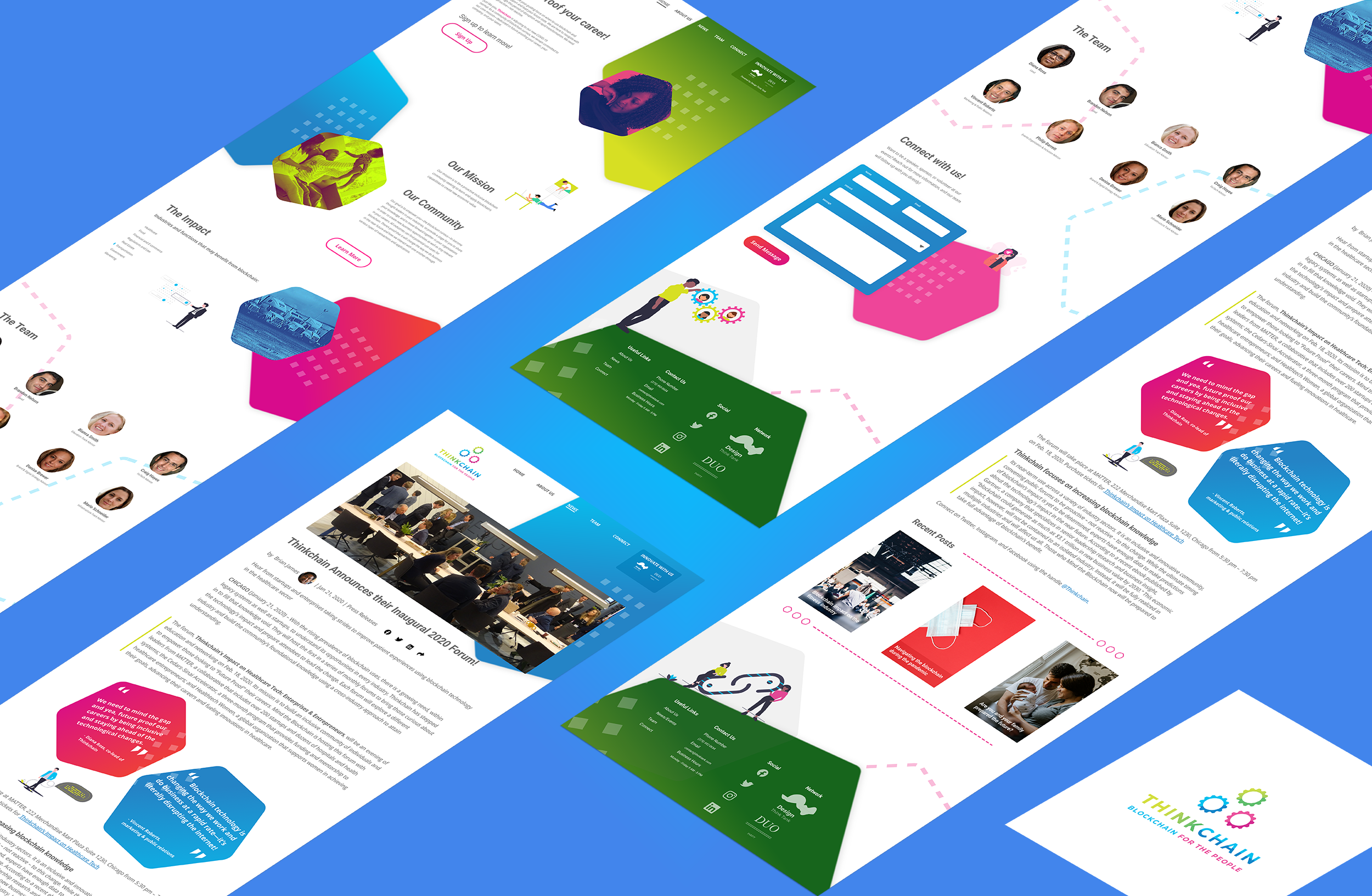
Thinkchain Design V1

Thinkchain-News Design V1
The geometric shapes I pulled from the original Thinkchain marketing site gave me the incentive to use the same approach from the Modernized Classic Style Tile because of the positive feedback from the users. With this approach, it gives an updated aesthetic along with keeping the familiarity with current users of the site. The gradient clean up for the green was contrast and legibility. Whitespacing to allow the design elements and content for digestibility with a layout that creates a scrollable flow.
Client and User Feedback
We started on the right path of gaining more insight from our client after the kickoff meeting that was 60 minutes that I presented. My teammate facilitated Rose, Bud, Thorn workshop to see what was positive, negative, and what had potential in the current marketing sites. The end result was modernity was stressed during the workshop.

Overall the other brand’s logos need to be defined more so they are more apparent to the user. The user was able to identify that they might be partners but we need to refine this so they look like they are associated under the same company. They need to stand out / be defined more on the page so the user can tell on first glance. I recommend that the logos used should stay consistent as well, there were some instances on Duo Parity where different logos were being used.
Key Insights
Design looks cleaner
Clean up gradients
Check on size for consistency
Final Solutions
With the last round of client and user feedback we landed on the following solutions:
branding/logo header and footer
Visual cleaned up

Design Solution
Based on the five user interviews and feedback from our client. We made the decision to display the other brands on each website on the header and footer of our designs, along with using pill-style buttons for consistency. I made the decision of keeping the logos of the other brands white because it would distract the users.
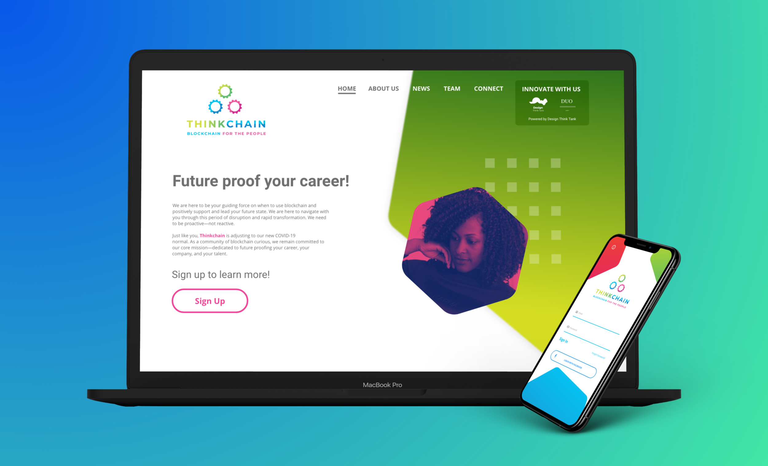
During the designing process of designing Thinkchain. I wanted to make sure my design of Thinkchain was a more modern version of the original. I used hexagons, squares, and the typography from the original design. Like Design Thank Tank, I still wanted to keep that familiarity for her clients.
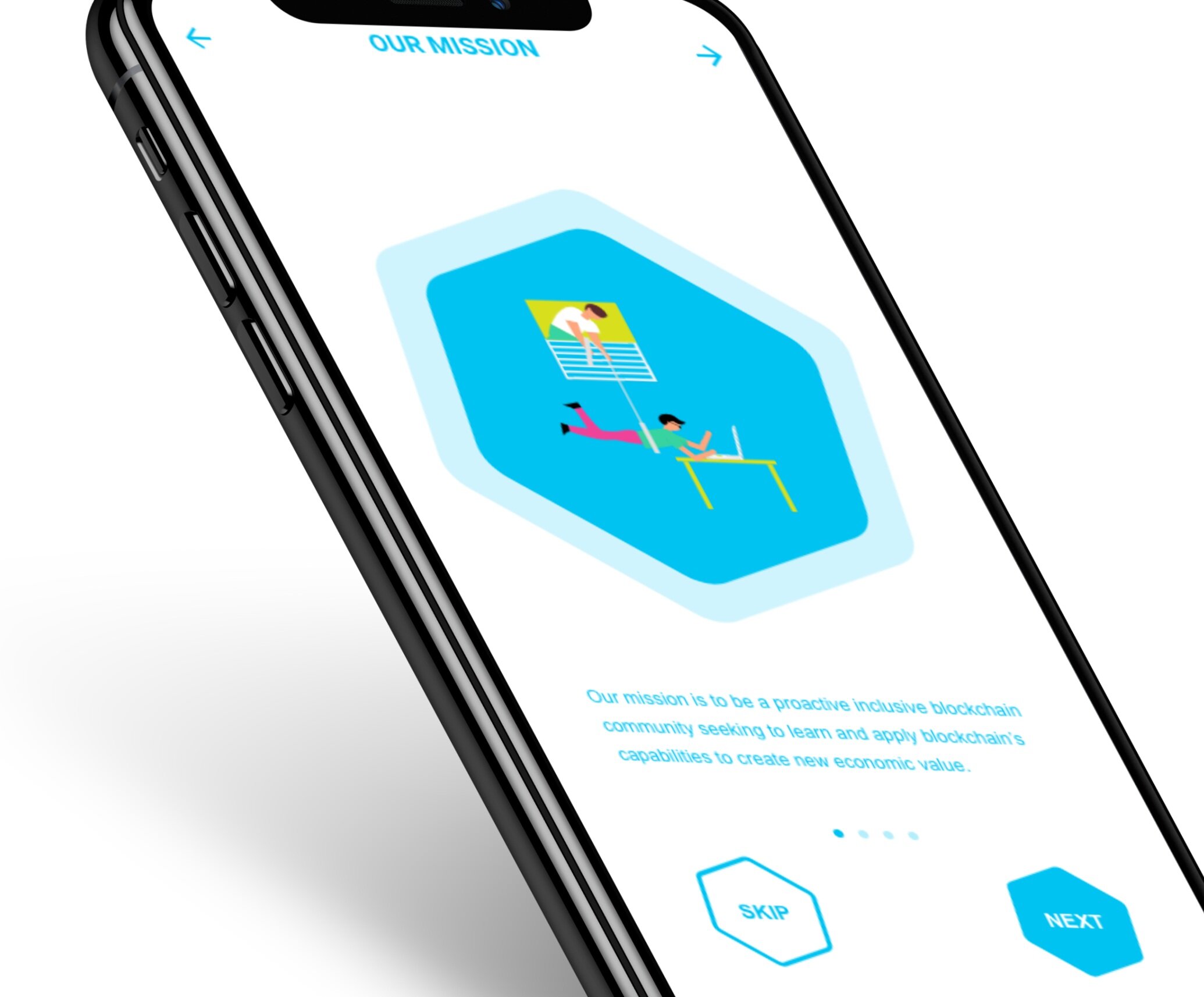
Supplemental Microinteraction

Thinkchain Mobile Animation
This animation displays the options of liking, disliking, and sharing the article. User interaction creates a greater likelihood of retention.
Future Recommendations
The results are still yet to be determined metrically however as part of project handoff, the design team and I provided recommendations for ongoing development for the project.
Optimize the site for mobile users. Much of your client base (c-suite) are very busy and use their phones for business when they are on the go. This will be useful for them to clearly view each website with ease.
Consider integrating workshop sign up within the site instead of linking out to third parties. This will make signing up for users more seamless and will avoid any confusion for them. Keeping everything in-house will also help solidify each brand as a self-sufficient as well as preventing the outsourced sign up as an ad.
Continue to incorporate common elements within each brand’s site. This will further make each brand’s site look cohesive under one umbrella.
Capture more high-quality photos during future workshops to feature on your website. The photos that really spoke to users were the candid ones where people are interacting with each other. This will help to reduce the number of stock photos and give more authenticity to the sites.