
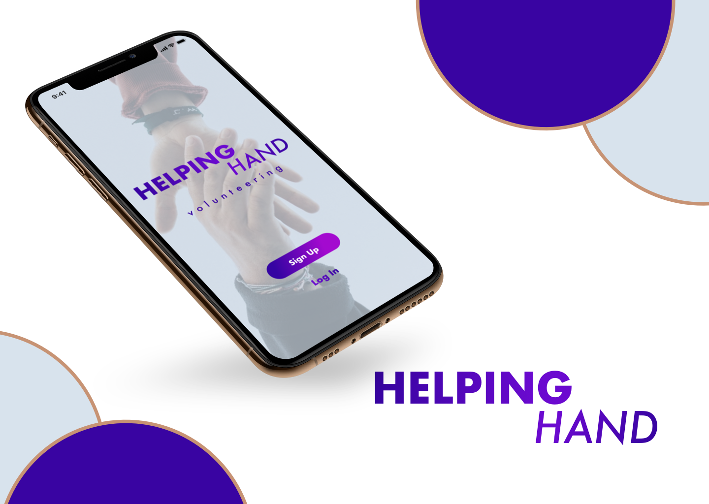

Helping
Hand
Helping Hand is an app for professional ages 25 - 40 with busy schedules that wants to volunteer.
Overview
Timeline: 10 Weeks (20 hours per/week)
Roles: UI Designer, Workshop Facilitator, User Research
Tools: Sketch, Adobe XD, InVision
To design an engaging application that incentivizes people to volunteer for 2 hours max.
view final prototype


Project Summary
As apart of a school project my team was with the task to design a volunteer-facing mobile app that encourages users to get involved and evoke positive emotions for volunteering. My particular role was designing an engaging human-centered design for users with a clean aesthetic. The app needed to include an incentive structure, animations, and a clear navigation path for users to find microvolunteering tasks.
Targeted Users

Our targeted users are professionals ages 25 - 40 with busy schedules. We needed to create an established interaction design that maximizes their time efficiently with social media integration.
Stakeholder Desires & Questions
The stakeholder desires for the app:
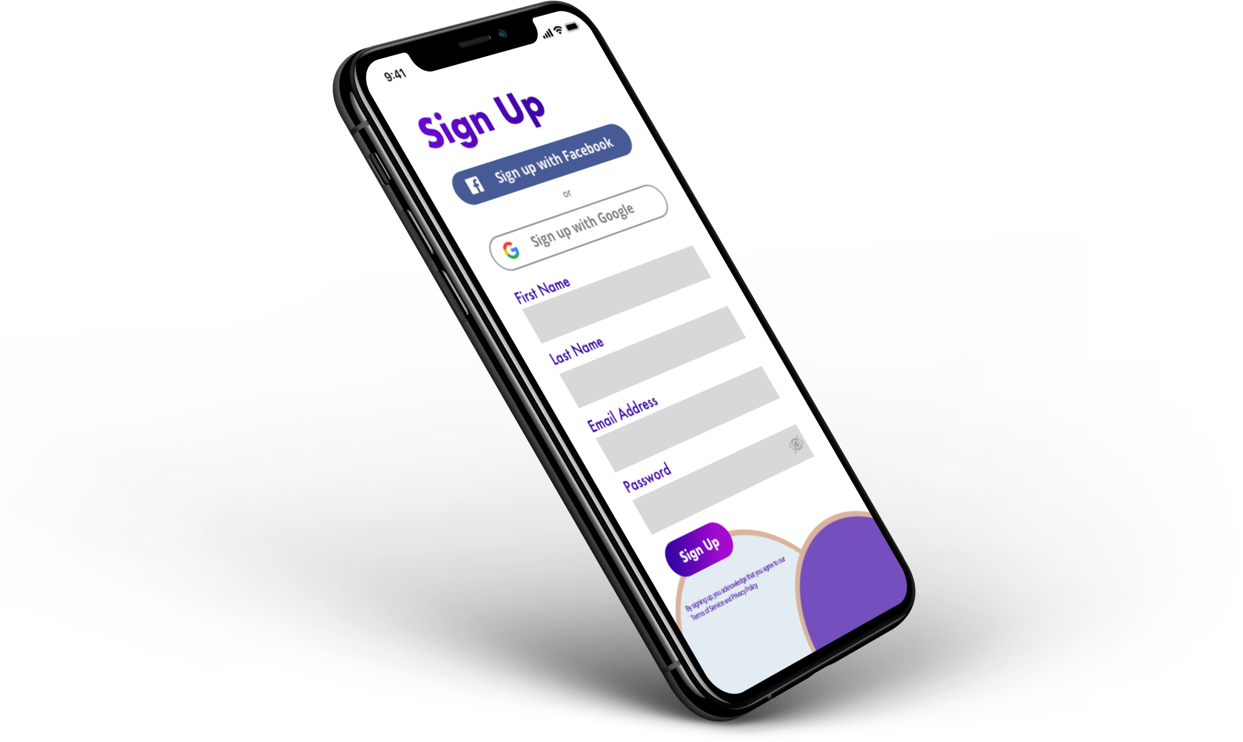
High-fidelity screens for the volunteer portal on mobile devices
A design system that can be leveraged for future build-out of the platform
The stakeholder’s open-ended questions:
How can we encourage community members to volunteer?
How can we make the app feel more interactive and engaging?
How can we incentivize microvolunteering tasks?
Human Centered Approach
We started off with understanding the importance of inclusive and accessible design especially for an app that centers around volunteering. We want to assure that our design is accessible for users of all walks of life. User sourcing helped us out empathize with our potential users when it comes to gaining insight into their behavior and knowing what they want.
In the ideation phase, we came up with Five Human Values during our Mind Mapping workshop that we wanted to be mindful of our design from a UI standpoint:
Trust
Responsibility
Equality
Safety
Longevity

Mind map for ideas for the app
Another workshop was needed to establish the top three features in the design that will keep user retention with the priority matrix:

Priority matrix to determine the top three features
Accolades - Users want to see their achievements to give them a sense of the impact they’re making.
Social Media - Users want to build connections beyond the app and social media will allow users to build new relationships.
Joining a group - Users want to join like-minded people who share similar interests. It will incentivize them to find volunteering opportunities based on interest.
Discoveries
I conducted two user interviews with men in their mid-twenties and early-thirties respectively. I discovered that the concept of microvolunteering a relatively new yet intriguing. That gave us an opportunity to enlighten and educate the interviewees on the concept.
One interviewee has experience in volunteering in the past, but when presented with an app that can help them get back into volunteering, they were all for it. This can prove that our app can ignite the spark of having people volunteer again.
From one of our human values, the color blue was known for its trustworthiness, and loyalty when it comes to branding. For my concept, I decided to go with purple because it’s associated with understanding and sensitivity. I wanted to give the user a sense of comfort with the color palette.
Solutions
Along with our Five Human Values, we came up with our design principles in our intent to focus on these main things when we’re designing:
Our Design Principles

Motivation

Options

Hierarchy
Motivation - I used an accolade system that will lead to rewards and giving them the ability to share it with their friends via social media. Along with that a reward system for referrals.
Options - Giving the user options on when, where, and which cause they want to volunteer gives the power of choice to the user.
Hierarchy - In aspects of visual hierarchy and to make the navigation seamless.
I created three moodboards and style tiles in the process of finding the right look for the final design. I completely skipped the process of doing a wireframe before designing my high fidelity mockups. That was a mistake on my behalf and a hard lesson that was learned because the process would’ve been a lot more seamless if I just took that extra step.
I conducted a usability test with two participants to get some feedback. The intent and goals were seeing if the design prototype was user friendly, easy to navigate, and easy on the eyes. I sought out for gender parity by selecting one male and one female for testing. I used Zoom, my Invision prototype link, and otter.ai for record and transcribe the testing and interview. The lesson I’ve learned overall is that more testing leads to more insights. With more insights, it opens up more design decisions.
Testing environment: I used Zoom, Invision, and otter.ai for testing and interviewing. The user tests were about 30-45 minutes long.
Data results:
The onboarding had the highest completion rate, didn’t really have the lowest completion rate, to be honest.
The testing took about 10 - 15 minutes, the interviews were about 15 - 20 minutes.
80% satisfaction rate because there was more to be desired for more exploration of the app.
Summary of findings and recommendations: I found out testing as much as possible provides a great deal of insight and a pathway making or changing things in your design. From the impressions, I’ve received is more social media involvement (i.e. group chat, stories, photos, and reviews).
Results
The project is on the right track. In my opinion, each one of our apps is a definite success. In my app, in particular, I covered all that we have established and discovered throughout this design process: the reward system, sharing on social media, a quick bit on micro-volunteer jobs, and using positive photography. Through my user interviews, I’ve received nothing but compliments (aside from adding a notification system) and the users wished they can download and use the app for their own use.
