
San Diego Code School
Creating Coding Careers (CCC) is a non-profit organization that helps people to make a career transition to tech.
San Diego Code School (SDCS) is the program under CCC that gives new apprentices real-world experiences by learning on the job.
SDCS’s website design looked increasingly dated in comparison to other coding schools. An overhaul was asked for by the stakeholders.
Client: Creating Coding Careers
Project Type: Desktop & Mobile
Timeline: 2.5 Weeks
Role: UI Designer
Tools: Figma
view website
The Challenge
Bringing SDCS to the 21st Century

This was San Diego Code School’s website
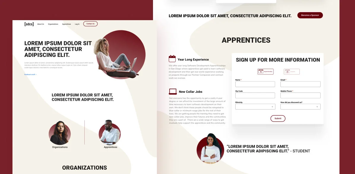
With the new redesign, SDCS wanted to bring modernity (“Bring us to the 21st century”) to their website. They work with major tech companies, but their website didn’t reflect that fact poorly.
The KPI for success is a 55% increase in donations for the nonprofit, a 40% uptick in traffic to the site, and a 10% increase in sponsorships at the multiplication of levels offered.
The Process
I analyzed the previous structure of the interface and wrote down everything that I could think of that made this site underperform from a visual aspect.
Taking a look at their competitor’s websites also helped me to see what opportunities that SDCS can capitalize on visually.
I didn’t have that much time to sketch, as the stakeholders were two weeks out from unveiling the new site, but I jumped right into designing a wireframe before designing the high fidelity mockup.


Oops…I almost forgot to mention the Style Tiles!


I presented three style tiles to the stakeholder to see which creative direction to take.
Getting On Board with a Visual Identity

Setting the foundation with the wireframe


I was on a time crunch on getting the redesign ready for the software engineers. I knew I was pressed for time and I used a Platforma Web Wireframe Kit, and it really helped me to get things going.
Reflection

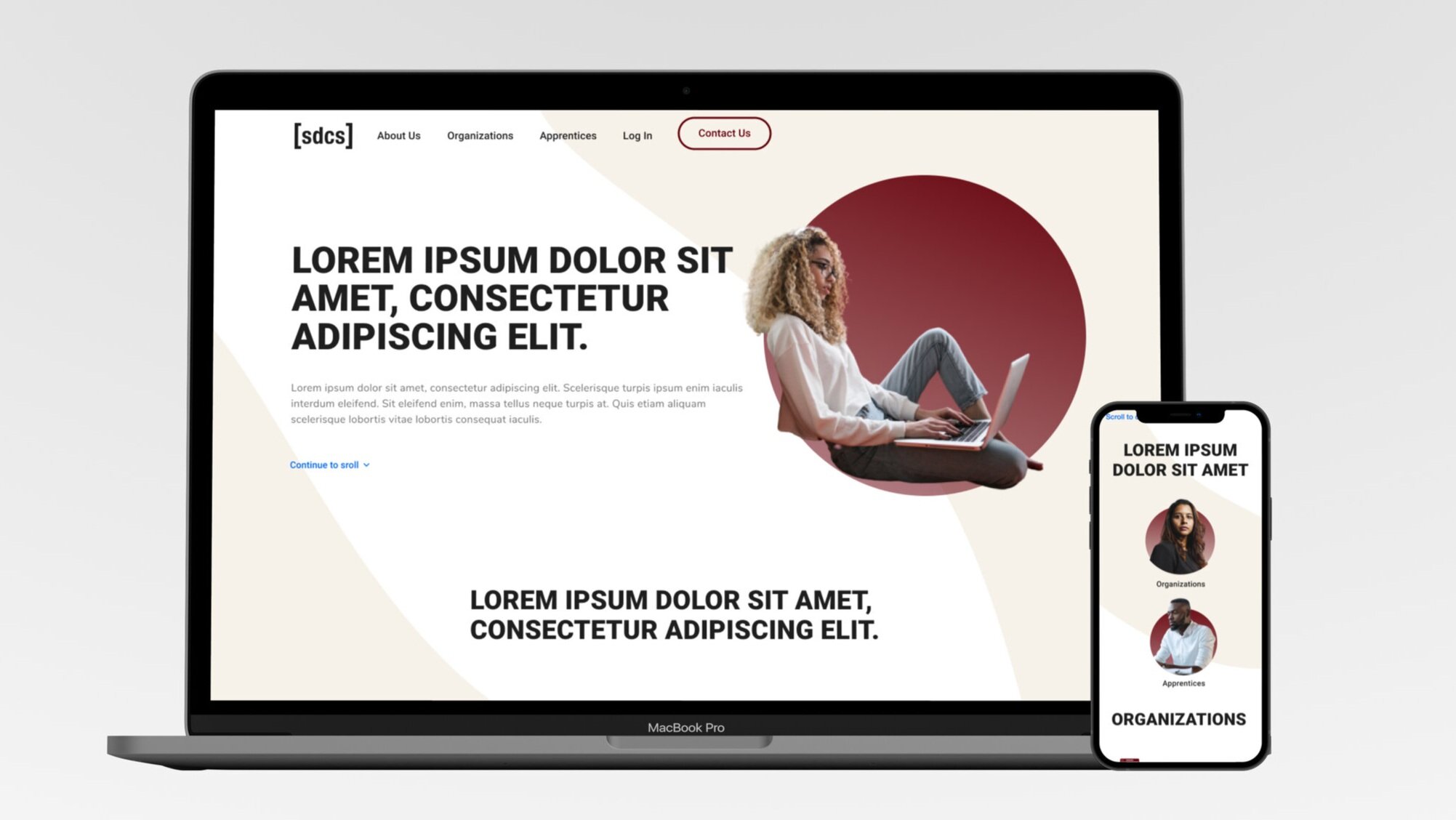
A collage of the pages I designed. Most of them haven’t been implemented for the live website.
I had valuable experience in spearheading the design decisions and facilitating a couple of meetings for this project. Although there are other parts of the website that’s still in development. I didn’t receive the information in regards to an increase in sponsorships.